Preferred Business Systems
Preferred Business Systems
How Quantus Transformed Preferred Business Systems into a Modern, Memorable Brand
Client • Preferred Business Systems
Type • Complete Rebrand
Location • Tulsa, Oklahoma
Industry • Office Technology, Managed IT & Print Services
CREATIVE
BRANDING
BRAND KIT
WEB DESIGN
DEVELOPMENT
LOGO DESIGN
How Quantus Transformed Preferred Business Systems into a Modern, Memorable Brand
Client • Preferred Business Systems
Type • Complete Rebrand
Location • Tulsa, Oklahoma
Industry • Office Technology, Managed IT & Print Services
CREATIVE
BRANDING
BRAND KIT
WEB DESIGN
DEVELOPMENT
LOGO DESIGN

Key Results
Key Results
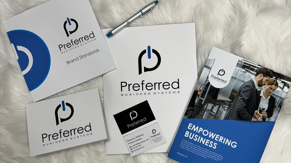
Complete visual identity overhaul
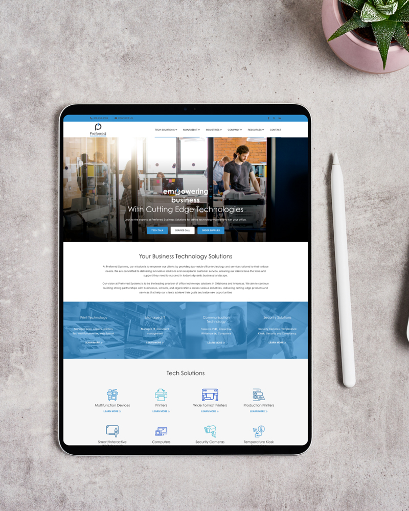
New website built to modern UX standards
Clear positioning for local and regional B2B markets
Unified brand guidelines for consistency across all platforms
Fully redesigned modern website
New website built to modern UX standards
Clear positioning for local and regional B2B markets
Unified brand guidelines for consistency across all platforms
The Challenge
The Challenge
Preferred Business Systems had been serving the Tulsa metro with reliable office technology solutions for decades—but their brand identity hadn’t kept up with their evolution.
They were known for high-quality service and trusted vendor relationships, but their outdated logo, inconsistent visuals, and legacy website didn’t reflect that. Worse, the fragmented branding sent mixed signals to both prospects and long-time clients. There was a clear gap between who they were and how they looked.
Quantus was brought in to bridge that gap—with a full rebrand that would signal confidence, modernity, and relevance in a crowded B2B services landscape.
Our Discovery & Strategy
Our Discovery & Strategy
We started with a deep dive into:
Their company values and client base
The competitive landscape across print and IT support
Existing touchpoints: email signatures, sales decks, vehicle wraps, and social media
It was clear they needed a new brand identity system—not just a logo refresh. We aligned around three goals:
Develop a versatile, professional brand that could scale with growth
Build a website experience that felt high-touch, not high-friction
Equip their internal team with a brand guide they could actually use—so everything from proposals to polos felt aligned
We began by identifying the biggest gaps:
Visual brand did not match the company’s trust and local reputation
Navigation buried key conversion points like “Get a Quote” or “Contact an Agent”
Service categories (Home, Auto, Business, Life) weren’t easily findable
The site lacked SEO structure and mobile performance
The opportunity was clear: create a site that instills immediate trust, streamlines the user experience, and sets up Paducah Insurance to win new business through both referrals and search.
Our strategy focused on:
Modern, minimal site design that evokes trust and ease
Mobile-first UX optimized for quote requests and service discovery
Technical SEO structure to prepare for long-term visibility
Scannable layout and messaging to convert busy users in 30 seconds or less
Execution & Solutions
Execution & Solutions
We developed a modern, geometric logo mark that communicates precision and trust—qualities central to their IT and office solutions. The refreshed color palette introduced tech-forward blues, confident dark tones, and clean visual hierarchy. Typography was standardized across headings, body text, and interface components for brand cohesion. We delivered a full brand guide that outlined logo usage, color codes, type standards, imagery style, and tone of voice—providing internal teams with a scalable, day-to-day playbook. For the website, we designed and developed a clean, conversion-focused layout using WordPress, complete with a simplified sitemap and clearly defined service pages for Managed IT, Print Services, and Device Sales. The site includes an intuitive “Request Support” workflow, enhanced mobile usability, and internal SEO best practices like structured headings, schema, and optimized metadata. Altogether, the rebrand and website rebuild repositioned Preferred Business Systems as a modern, trustworthy service provider in a competitive B2B space.
Ready to See the Same Results?
If your website doesn’t reflect your brand—or your marketing doesn’t drive ROI—maybe it’s time for a fresh set of eyes. Let’s turn your digital presence into a growth engine.